Provenance was preparing to launch from stealth with a new approach to helping people celebrate life's major milestones, starting with weddings. They needed to capture attention in a space where countless wedding services compete for couples' time and money. The challenge: launch an MVP to establish a new product category and build a marketing website to drive user acquisition.
This started out as a short-term project to help Provenance launch, but it turned into a 3-year-long engagement during which I helped Provenance grow and reach profitability. As a Principal Product Designer, I designed and launched the MVP and marketing website, pioneered AI UX patterns that predated industry standards, co-led SEO efforts with their Head of Marketing (achieving 15x traffic growth), and optimized the entire conversion funnel, helping the company scale their user base from zero to 200,000+ couples.
Design Lead, Principal Product Designer
Both the initial launch and further iterations produced great results and helped the company become profitable.
Ljubomir is a one-of-a-kind designer and teammate, and I effusively recommend and advocate for him with the fullest confidence. Beyond his UI/UX design talent itself – which is spectacular, consistently generating high caliber work with speed – Ljubomir boasts a variety of attributes that make him stand out in the field. He has brilliant intuition, often displaying a deft understanding of complex user challenges and industry dynamics alike. He is a disciplined hard-worker, consistently turning around big and small assignments alike on time or early. He has a growth mindset and attitude, never balking from a task outside of his past expertise. We 100% intend to work with him again and know that anyone else who similarly counts Ljubomir on their team will feel as lucky as we do.
Ljubomir is a phenomenal product designer and an invaluable teammate, and I wholeheartedly recommend working with him. Beyond his exceptional product design skills, consistently producing high-quality work swiftly, Ljubomir often demonstrates a deep understanding of complex product and strategic challenges/goals. He is a great team player, collaborating with product, marketing, and engineering teams exceptionally well. Quite often Ljubomir would present clever solutions for existing user challenges as well as identify new possible improvements outside of the scope of the initial project, making his designs truly stand out. We are eager to collaborate with Ljubomir again and know that any team fortunate enough to have him will feel just as privileged as we do.

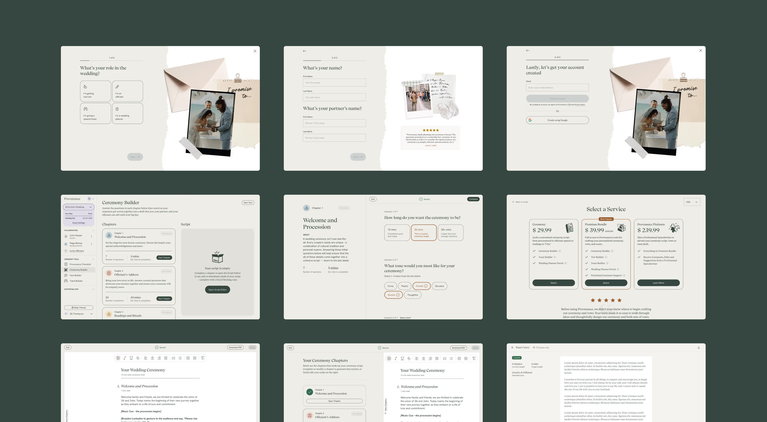
With Provenance preparing to launch from stealth, my first challenge was designing the MVP and getting it ready for launch.
I started with discovery to understand the team's vision and the plans they had for the product. Weddings are very complex by nature and for that reason getting alignment before starting any design work was crucial. To tackle this complexity, we decided to focus only on the ceremony and not try to tackle all aspects of a wedding. This focused scope allowed us to launch faster while solving the most intimidating writing task couples face.
After we identified the key areas to focus on, I moved on to devising the app structure and what the user flows would look like for different user roles. These roles needed to have different levels of access to the tools and information regarding the wedding, requiring careful planning upfront. Aligning on these flows early with the team through flow charts helped us move faster and avoid having to rework parts of the app later on, which could be both costly and time consuming.

Once we had a structure in place, we moved on to wireframes where we explored how each screen would be laid out. This allowed us to quickly sketch out different user flows without having to spend too much time thinking about visual design details.
The main focus during the initial stages was on onboarding and the Ceremony builder, the main tool in Provenance’s wedding app, made to help couples write their ceremony script. This laid the foundation for further expansion and paved the way for introducing additional tools.
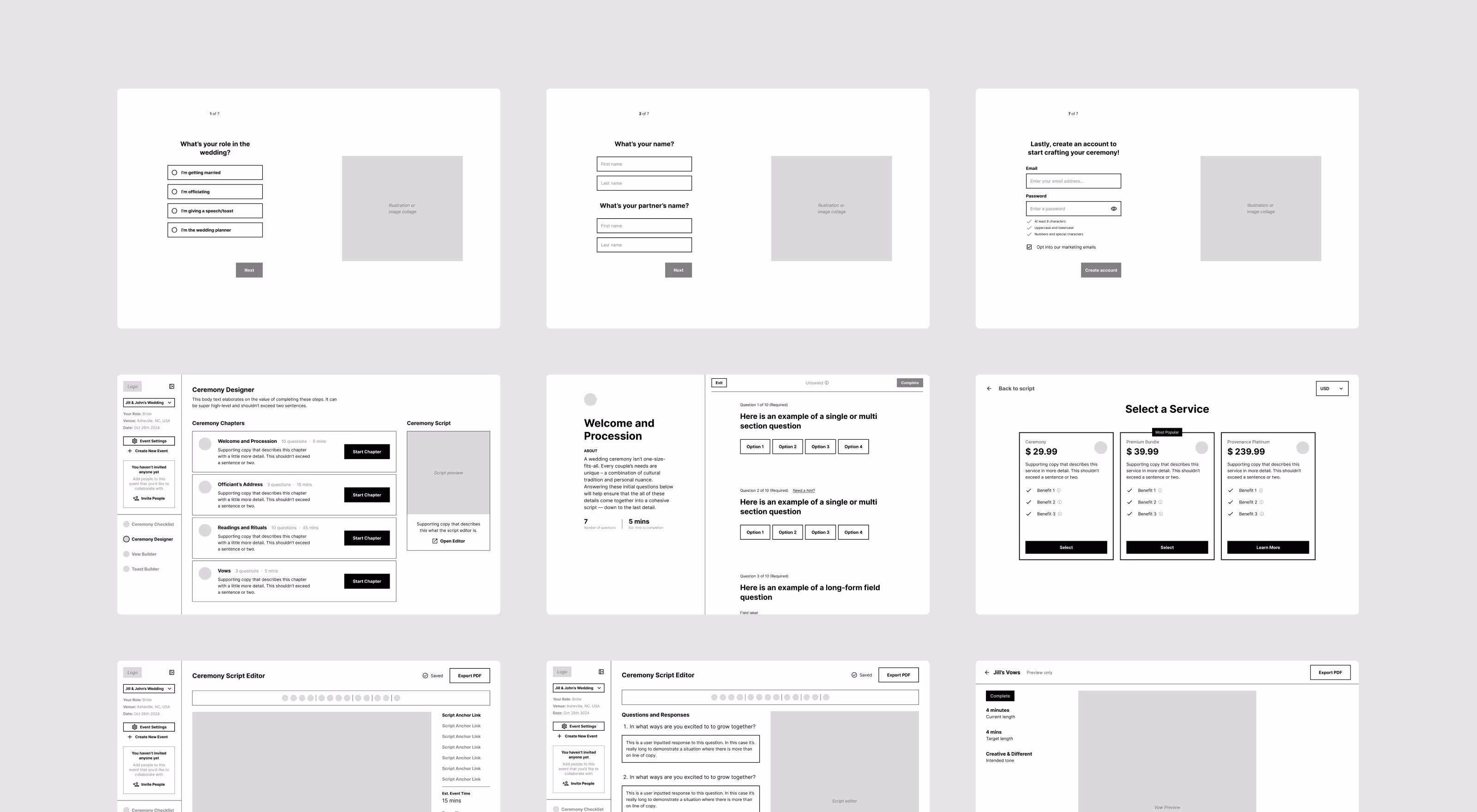
With wireframes approved, I moved to UI design, creating development-ready mockups. This included defining the app's visual identity (typography, color system, component library) that aligned with brand guidelines while following UI best practices. I made sure to design for the emotional nature of wedding planning, keeping interfaces calm and encouraging rather than overwhelming. The result was a cohesive UI that developers could implement efficiently.
Once the MVP was in development, I shifted my focus towards creating a marketing website that would showcase Provenance's offering and convert visitors into users. This included defining the site structure, designing the homepage and tool-specific landing pages, and planning the blog architecture.

Once designed, I implemented everything in Webflow and maintained it over the next two years as Provenance released new products and evolved existing ones, ensuring the website expanded alongside the product.
After launch, we continuously improved the product, addressing user pain points and evolving the brand to better serve our audience.
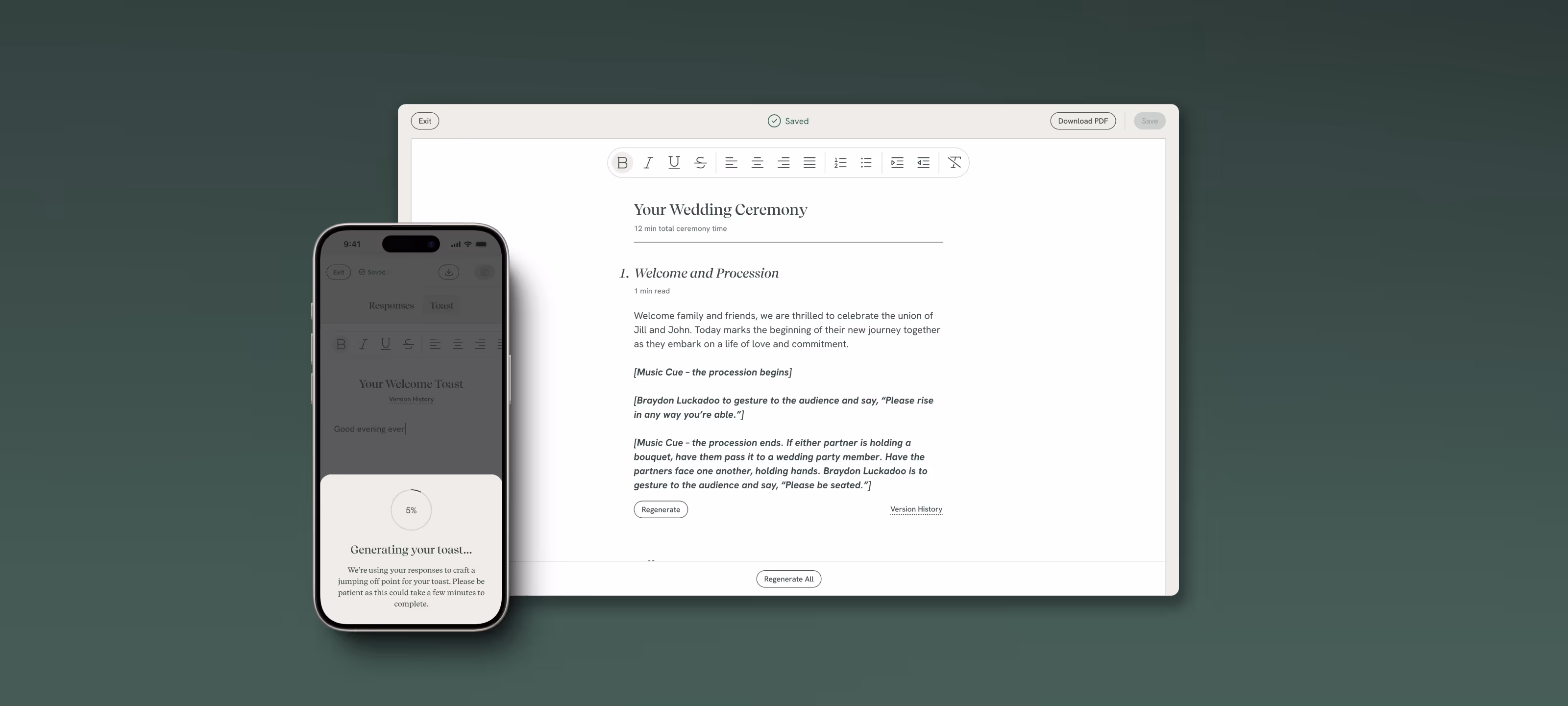
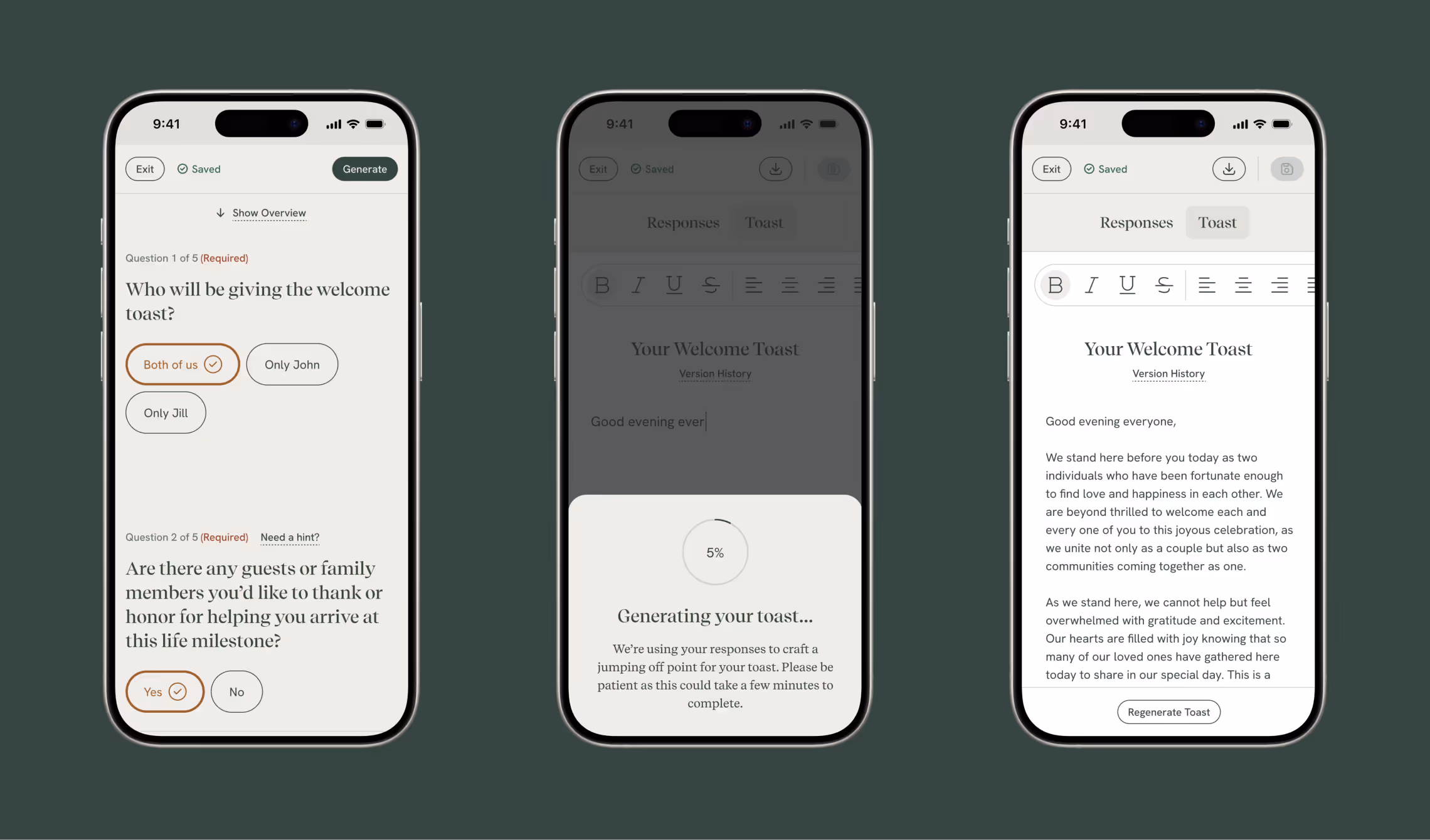
The Ceremony Builder is made up of 6 modules, and the initial idea was to have the user write all 6 parts separately and put them together only when the user exports a PDF. Users found this confusing and a lot of them ended up abandoning the flow, which needed to be addressed.
I fixed this issue by rethinking how the tool could work. I redesigned it around a text editor screen where users can see the whole script at once, in a format very similar to other text editors they are already familiar with, along with a side-by-side view that allows users to have both the questions and the script open at once - a UI pattern I would later apply to Provenance’s AI-powered tools.

The redesign was a success, with 10x more users successfully completing the flow. This redesigned script editor later served as a basis for other tools, like the Vow builder and Toast builder.
With the core user experience solidified, the next step was evolving the brand to better reflect the product's personality. When I joined, there were preexisting brand guidelines, which we significantly evolved during the redesign. In that process, a lot of inspiration was drawn from wedding scrapbooks. Elements like torn paper, photo collages, and playful illustrations influenced the app's overall aesthetic in a meaningful way. The color palette and UI elements we defined during this process laid the groundwork for the design system we would later create.
We launched the MVP in the fall of 2022. Only about a month after that, ChatGPT launched and started the AI wave. Since our product was a writing tool, we knew we had to adapt, or risk becoming obsolete.
At the very beginning of this process, I took it upon myself to read the full developer documentation for API integration of different AI models. I researched and compared different options that could work for the Ceremony builder, comparing factors like output quality, cost per token, latency, and API availability. I also started testing the output quality different models could produce, and conducted early prompt engineering experiments.
Once I had an understanding of the AI model landscape and how they could fit into the product, I created a report and presented it to the team. This document helped the team understand implementation requirements, cost implications, and distribute the tasks among appropriate roles, with my job being to design this new AI-powered version of the Ceremony builder.
With the strategy defined and roles assigned, we moved into the design phase. We knew we would build on top of the existing text editor tool and add AI-specific elements, but the challenge was that there weren’t many established UX patterns for AI at the time. Going back to basics, I designed an intuitive AI-powered interface, which was confirmed by later surveys and an NPS score of 70+.
One detail I’m especially proud of with this tool is the side-by-side view, a UI pattern that later became standard across major AI tools, and I introduced it very early on. We shipped this feature in early 2023, while Claude introduced its Artifacts feature in the summer of 2024, and ChatGPT got its Canvas in the fall of 2024.

One thing that went in our favor with the Ceremony builder was its structure which made AI the perfect way to make the process smoother for users and increase the value that the app provides. The biggest sticking point for most people was turning their answers into a first draft of their ceremony script, and Gen AI was the perfect way to solve this issue for them.
Another big improvement AI brought was a much smoother experience for mobile users as it removed the need to type out the entire first draft on your own. After we implemented AI, users could simply answer questions and get the first draft in seconds. They could then just make edits to it before exporting – a much more manageable task when on mobile.
Since the app used a freemium model, where you can start using it for free and pay to unlock the full set of features, having a smoother mobile experience helped convert more users who discovered Provenance while using their mobile devices.
Once the main wedding tools had gone through a few iterations, the focus shifted to bringing in more users and converting them into customers.
Since I worked on everything from the website to the paywall, I was in a unique position to help the team improve both by utilizing A/B testing. We ran a series of tests aiming to improve signups and purchases, and we managed to achieve double-digit increases in both categories. Even though this flow involved users completing a 7-step onboarding and creating an account, we managed to get signup and purchase conversion rates that are significantly higher than industry averages.
Beyond optimizing conversions, we also needed to scale traffic acquisition. While I took care of technical SEO from the very start, for the last 9 months of the project, I began contributing in a more serious capacity and became the lead person in charge of SEO. In addition to technical SEO audits and website performance monitoring, I started conducting keyword research and suggesting content ideas, adding schema markup and improving internal linking, all of which resulted in a 15x increase in organic traffic and a 460% increase in ranked keywords.
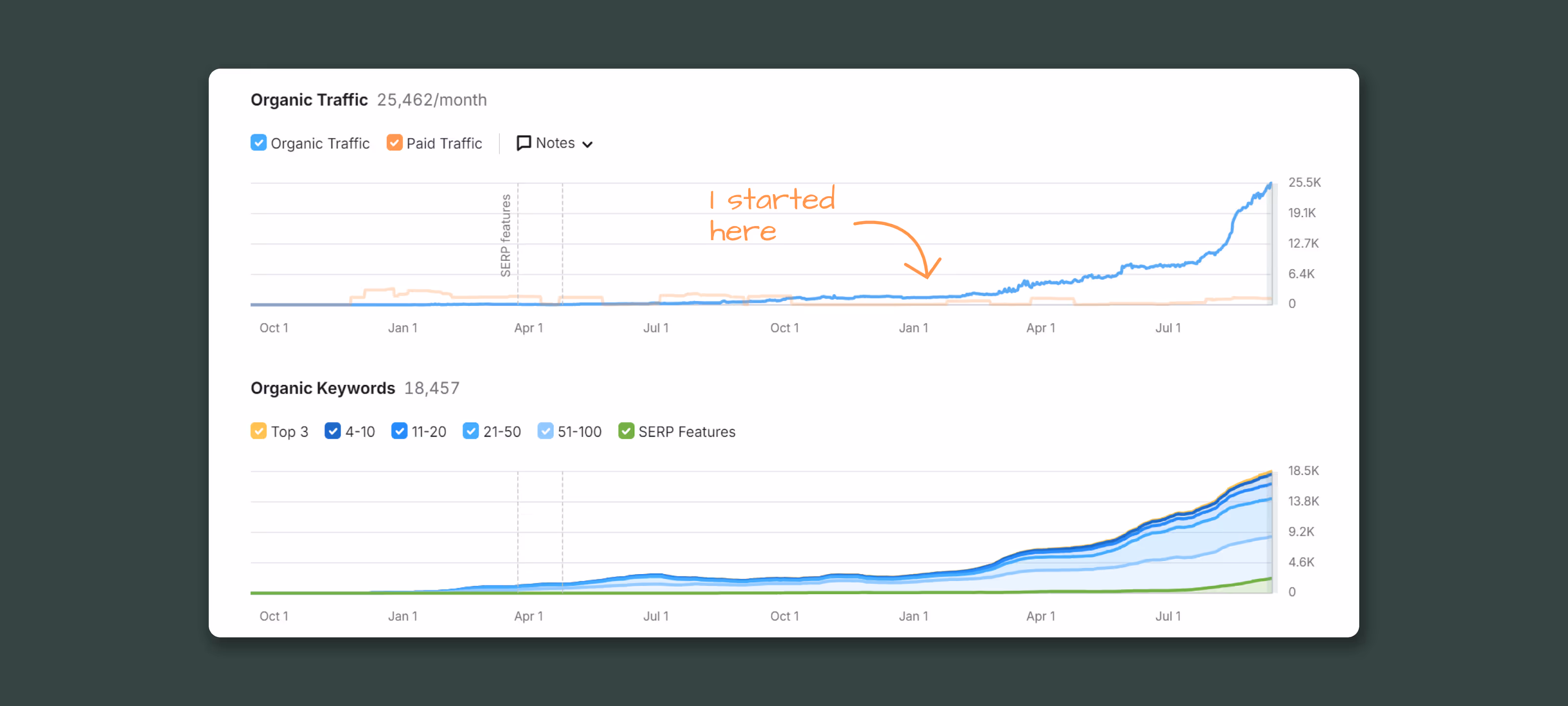
Due to the aforementioned 1554% increase in organic search traffic, the traffic value (metric showing how much money it would take to get the same amount of traffic through paid ads for the same keywords) has been averaging about $20,000 a month. This has been the case for over a year, totaling to more than $250,000 worth of additional organic search traffic so far, contributing greatly to the company's ability to become profitable.
Once the Ceremony Builder was launched, it was quickly followed by two more wedding tools: Vow Builder and Toast Builder. In some ways, they were similar to the existing tool, but in others, they differed, so the challenge was keeping the experience consistent, as it’s quite likely that one user will use all three tools for their wedding. Alongside these two tools, I also designed a flow for purchasing speechwriting services, enabling Provenance to diversify revenue streams beyond digital tools.
To keep all the tools consistent, and lay the groundwork for future expansion, we started working on a design system. In order for its implementation to be successful, all relevant teams had to be on board, so I worked on this effort alongside another product designer, and we coordinated the effort with the product manager and the developers.
This design system became the foundation for rapid product expansion, reducing design and development time for new features while ensuring brand consistency across all touchpoints. It accomplished this by being a single source of truth for brand assets and standardized UI components.
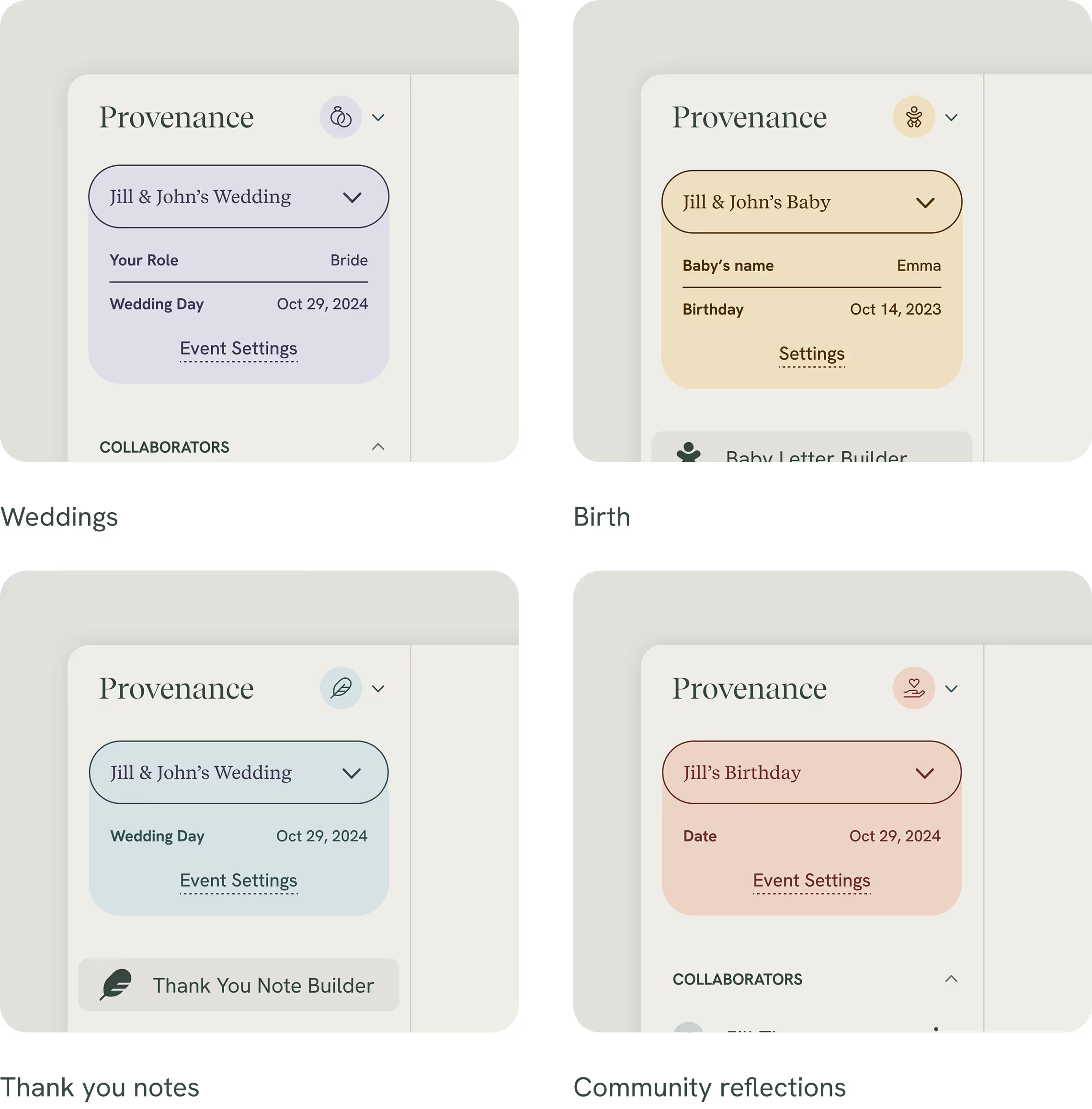
After the successful launch of the Provenance Weddings app, it was time to expand to other milestones. The next logical step was birth, so I was tasked with designing the Baby Letter Builder. This tool wasn’t supposed to be a part of Provenance’s wedding app, but live within its own app. We also decided to create tools that weren’t specific to one milestone, which would also live as separate apps.
This introduced two challenges, differentiating apps and navigating between them. To address both, I introduced the idea of color coding the apps, and I also designed a system of cross-app navigation that works hand-in-hand with color coding. This color-coded navigation system allowed users to seamlessly move between milestone-specific and universal tools, creating a cohesive ecosystem experience that encouraged cross-app engagement.
The work received media recognition, with features in Vogue, The New York Times, Wall Street Journal, Fortune Term Sheet, Brides, The Knot, and more.